Every company should critique its brand regularly, as the marketplace and design trends change. But a small-scale refresh can be beneficial as often as every five years because simply refining or adding to color palettes or typography can go a long way to keep your brand relevant. This fine-tuning can avoid the investment of time and resources as needed for a full-blown rebrand, yet these fixes make a difference.
When Elizabeth Christian Public Relations opened its doors 25 years ago, we debuted our very first logo. The design was meant to be simple and elegant with a friendly color palette and warm, welcoming monogram. Since then, we’ve rebranded twice to reflect our capabilities and our clientele, and we’ve done a few refreshes along the way.
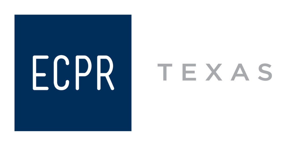
This week, ECPR unveiled our latest update—our 25th anniversary logo. To celebrate, we’re taking a nostalgic look at the evolution of our brand.
1995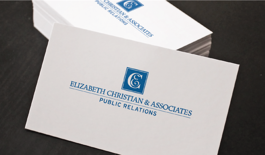
Our first logo holds a special place in our hearts. The cobalt blue color palette and square logomark set the tone and are still very much a part of our identity today. The mix of serif and sans serif fonts bring a nice harmony and balance to the layout.
2006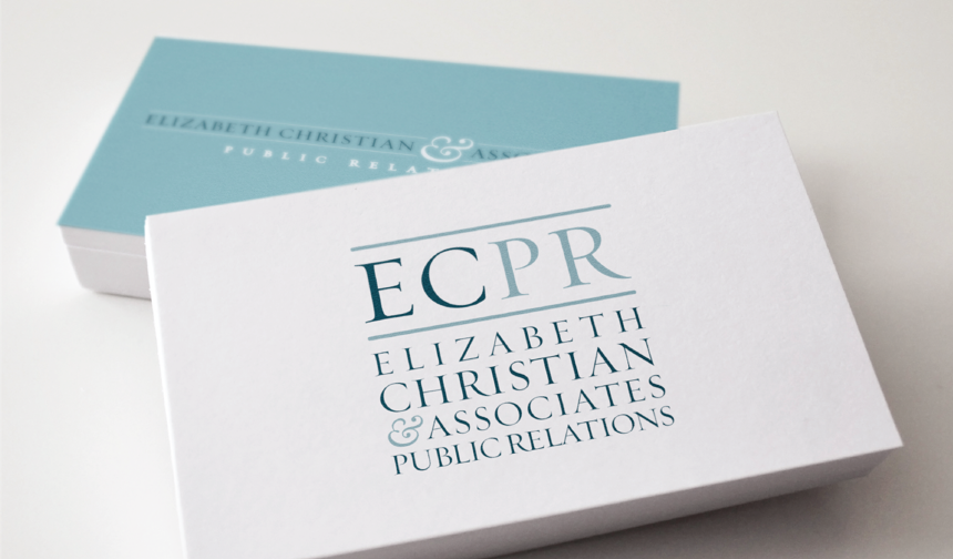
In 2006, we dropped our monogram—replacing it with our beloved “ECPR” logomark. By then, ECPR had become a common reference for the agency. We realized the importance of having both horizontal and vertical logo layouts, as we refined our color palette and updated our font to Trajan Pro. We also added visual interest with the stylized ampersand. The result was modern and trustworthy.
2015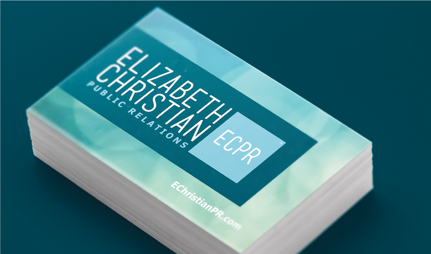
The rebrand in 2015 brought another logo change and our biggest departure from its origin. While the color palette and square logomark are reminiscent of the initial logo, everything else is vastly different. The leap in typography from our serifs of the past to a sleek, condensed sans serif—combined with Tahoma—makes way for a less feminine tone. In turn, the decidedly traditional design of past logos is transformed into something cleaner and more modern. We dropped “and Associates” to streamline the name and logotype.
2020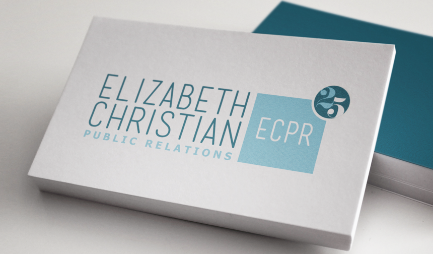
The brand rejuvenation for 2020 is timed to our 25th anniversary to uphold the logomark’s integrity while giving a nod to both our heritage and our future. The letterforms are vibrant and accessible, expressing not only a big anniversary year but also the exponential power of our experiences and client relationships.
Over the past 25 years, the ECPR brand has fluidly evolved alongside the company’s growth. The logo we use today is a perfect representation of where we are now—just as our very first logo in 1995.
Jen Liljegren is a graphic design consultant at ECPR and the founder and CEO of LilyPad Arts.